Domio | Guest App
How might we design a frictionless experience for independent travelers?
Domio is a hospitality tech company that offers curated apartment-hotels for solo and group travel. The Domio Guest App was created to be a hub for everything guests need to book, manage, and earn rewards on their stays.
Travelers seek to be self-sufficient. In user testing we learned that, more than anything, our guests want to solve problems on their own without having to call the front desk. To make that possible and profitable, we had two goals for this iteration of the app.
Design Objectives
Empower autonomy during a guest’s stay by significantly reducing the need for Domio staff assistance.
Design in-app opportunities for profit that fit within a delightful user experience.
what
UX/UI
when
Spring 2020
how
Sketch, Principle, UserTesting
with
Design Lead—Moi
Director of Product—Alex Grabowski
Engineering—Rares Crisan, Joe Oliver, and Mike Bell
Guest Experience and Operations Teams
Special thanks to Jenn Chow and Ryan Kwok for designing an excellent foundation.

Information Architecture
Knowledge is power
[Challenge] Our guests wanted to be self-sufficient, but the information they needed to be self-sufficient was too difficult to navigate and digest.
To uncover any pain points, we ran usability tests on Reservation Details, the section of the app where users can find extensive information on their stay and their Domio. We asked users to complete tasks that required them to find information during a hypothetical Domio stay (ex: “how might you find out how to work the TV?”). We discovered that if a problem arose during their trip, over 80% of guests would prefer to solve it on their own. Unfortunately, users could not easily find the information needed to solve problems or even assess what information was available to them.
Before

Key issues:
Each individual amenity or resource (topic), was designed to have its own full-page modal, regardless of how much information it offered.
Only seven topics could be featured on the home screen at one time. As there was no master list of topics, users would have to use the search function to find unlisted topics.
Most users were unable to locate the search function. Those that did saw a zero results error message if they did not use the exact keyword query attached to the desired topic (for example, using music instead of entertainment), making it impossible for them to know what information existed.
Users who couldn’t find what they needed resigned themselves to calling a Guest Experience Specialist—exactly what they wanted to avoid.
After

[Solution] I streamlined IA by sorting topics into four intuitive categories, using content and user data to guide design, and leveraging state awareness to only show the user what they need in the moment.
In my redesign, I sorted topics into four categories—essential info, check in/check out, policies, and support—and used state awareness (ie: pre-stay, in-stay, and post-stay) to only show guests the information they needed at that point in their journey. For example, users would only see information and action buttons regarding check in on the home screen if they haven’t yet checked in. Once the user has checked in, they would see information regarding in-stay amenities or check out in its place. I let information and user data guide the design (ex: info on Wifi is placed in the header of the Essentials where it can be accessed quickly while using the least amount of space).
By making these adjustments, I was able to eliminate the need for search, cut the number of screens needed in half, and organize information in a way that would be most intuitive and helpful for the independent guest. In tests comparing the two designs, 90% of users preferred the updated designs.
“I want to use technology as much as possible. I travel with tech-savvy people and we like to deal with issues ourselves.”
Adding Features
Convenience made digital
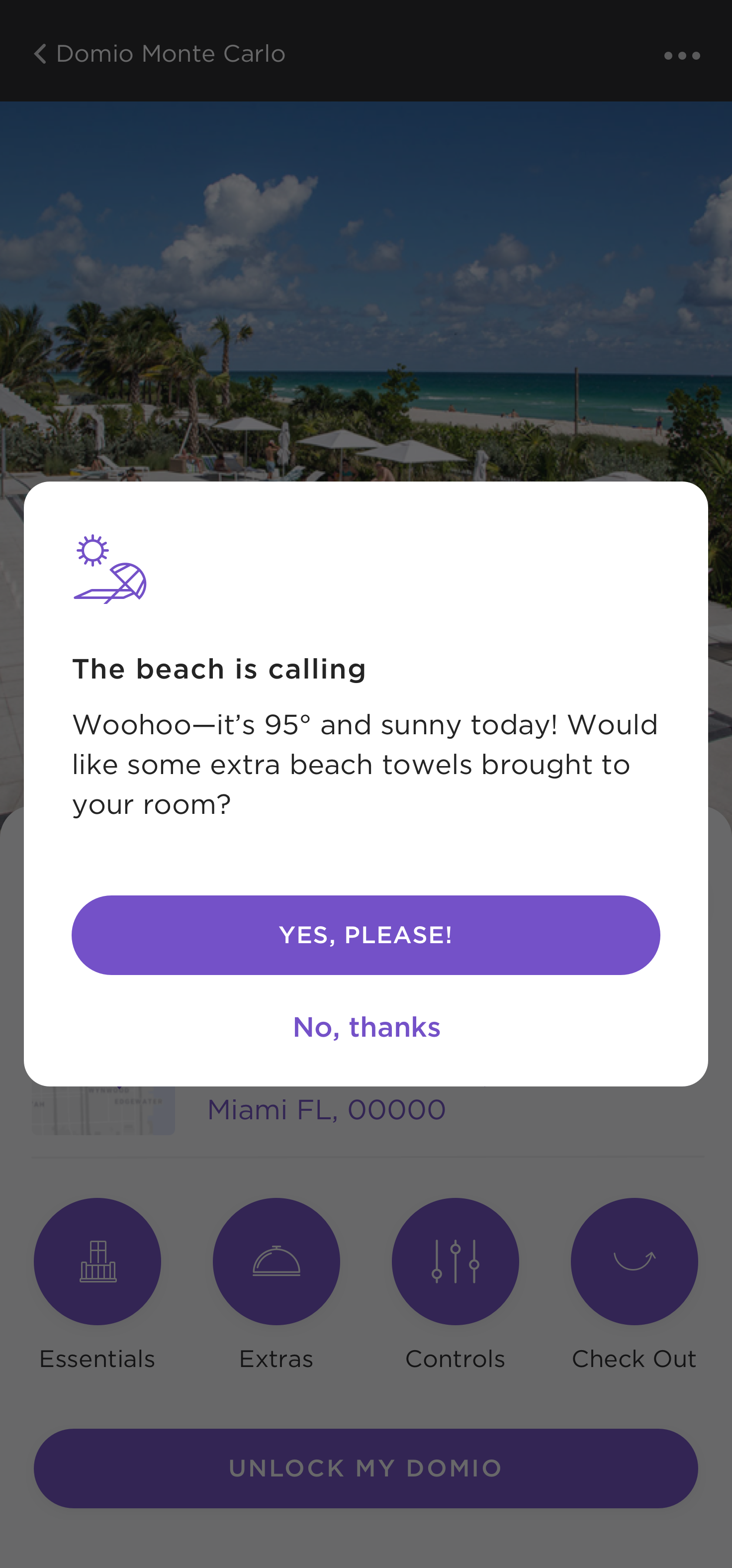
To further empower our guests we focused on how we might anticipate their needs both in the app and in their physical stay. Some features we introduced were the ability to save credit card details, share reservation details with other guests, digital entry to our Domios, in-app room controls, and intelligent notifications.


Integrating Business Needs + User Experience
Money in the time of Corona
This redesign coincided with the onset of the coronavirus pandemic. As bookings ebbed and flowed with state-wide shutdown policies, we needed to find additional sources of profit. I designed opportunities including an in-app minibar, paid early check in and late checkout, paid guest requests like mid-stay cleaning, and more.


Behind the Scenes
We went with a phased approach on this project and designing in tandem with development and feature releases allowed me to receive instant feedback and iterate quickly. Our small team accomplished a lot in a short period of time and I’m incredibly grateful to the engineers I worked with for creating an environment of knowledge sharing that made me a better designer.
What I loved most about working on the Guest App was that it also required me to design for and empathize with a second set of users beyond our guests—our Guest Experience and Operations team members. Understanding how they work and interact with both the Domio spaces and guests was crucial to designing features that were actually useful and it allowed me to do a deep dive and build on insights from our Internal Tools team.
This is only the beginning of what’s possible for the Domio Guest App and I’m excited to see how future designers build on this latest iteration for a new era of independent travelers.